In case you missed it, Daniela styled this fab print in her little one’s nursery not too long ago, and the whimsical desert theme was right up our alley. That said, the whimsy of this print isn’t the only thing we love about it—in fact, it plays just as well in a sophisticated and modern living room as it does in a nursery. We’ll let Daniela show you what we mean…
 .jpg-ShCl_GA)
What’s wonderful about The Porter III—as well as many of Gray’s other prints—is how malleable it is between rooms. To drive this point home, I’m going to show you how I designed three separate rooms around the same print. So keep scrolling to see how my latest fave piece of art translates in three completely different spaces…
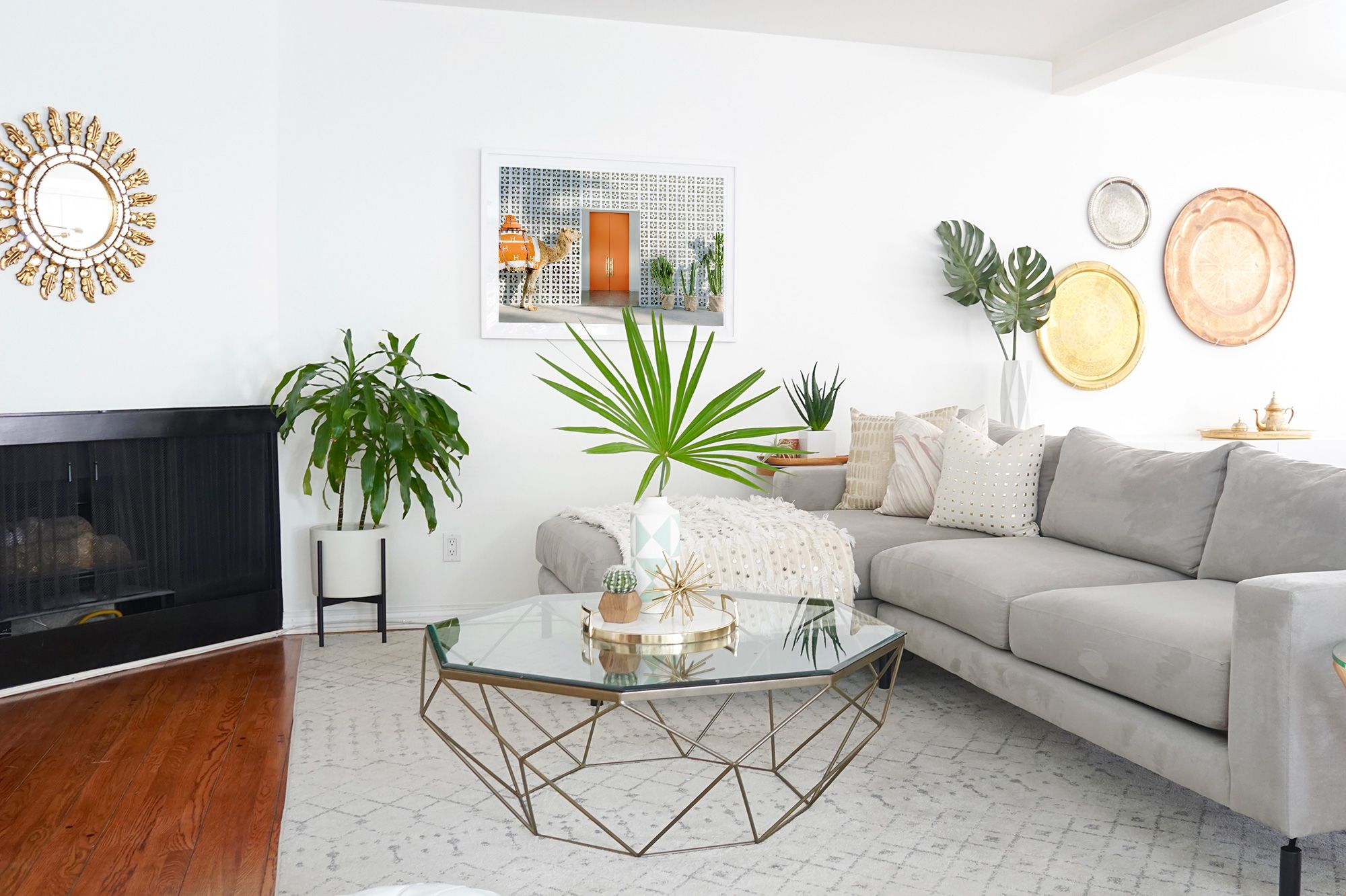
## First, a modern living room.
I resisted the urge to add orange accessories in this space, as I really wanted the print alone to add the pop of color. To any of you at home who are wary of going crazy with color on furniture and accessories, artwork is a great way to inject life into your space, while still complementing neutral staples throughout the rest of the room.
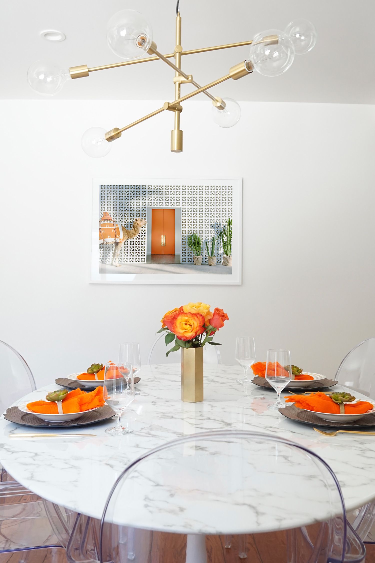
## Next, a dining room.
In a space where practically everything is white, I used the print to set the color scheme in arranging a tabletop palette. Just like the happy, mod print, the casual place settings are cheerful and inviting. Oftentimes in minimalistic, clean rooms, art becomes the centerpiece. Between the lucite ghost chairs, white marble tabletop, and crisp white walls, this dining room is no exception.
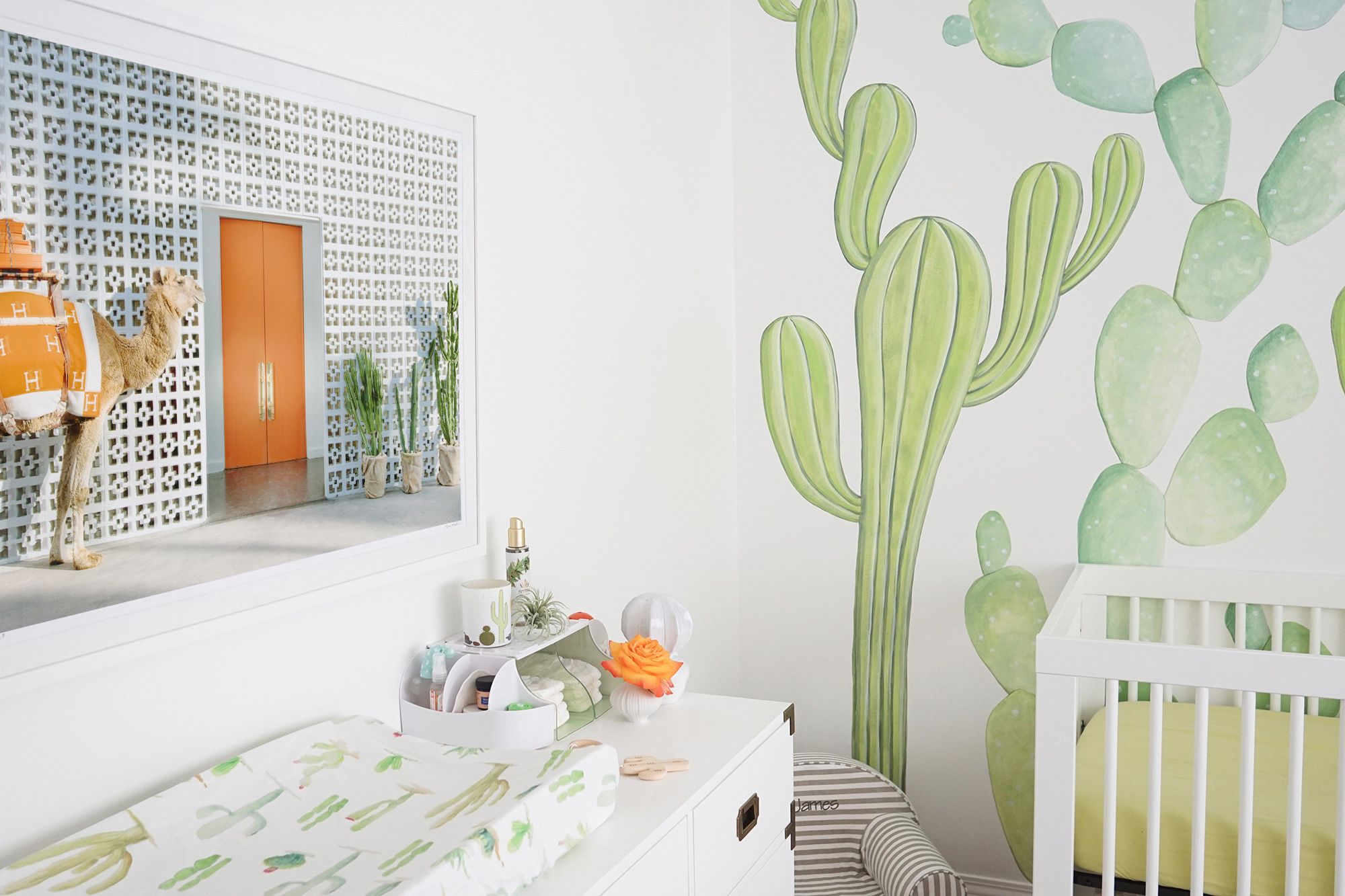
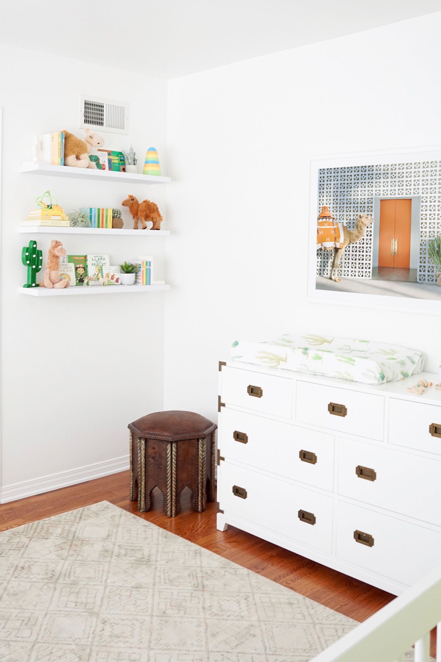
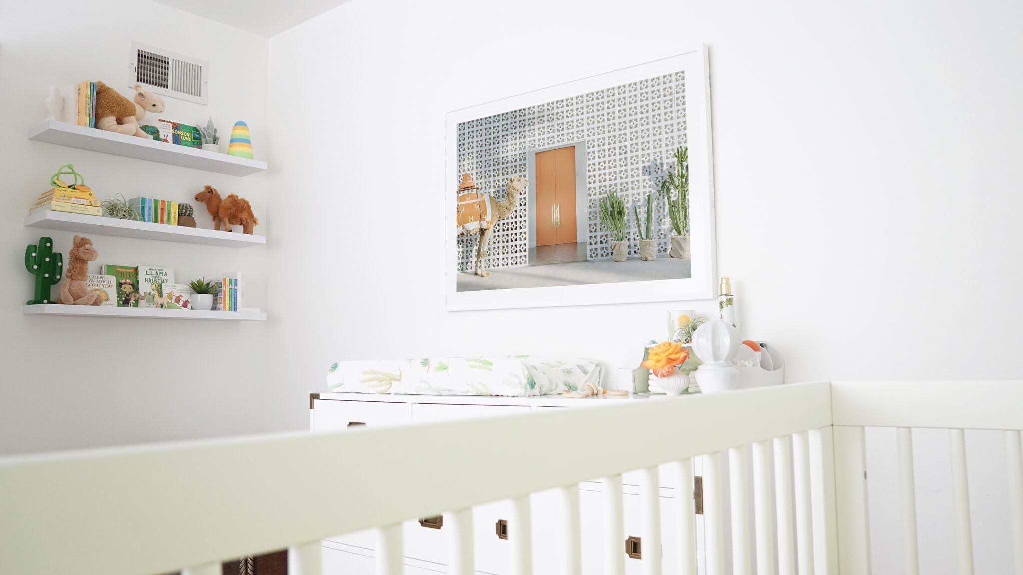
## Lastly, a baby nursery!
Because why have an Hermès-clad camel if you aren’t going to introduce your child to it, right? Start ‘em young! But seriously, this print is perfect for a nursery. It has color, an animal, architecture, and cacti—all fun things to teach baby. Aesthetically, it brings a necessary sense of whimsy into a child’s room, and looks sophisticated at the same time. Proof that nursery art does not have to be cheesy!
**Which room do you think fits this print the best?**
We’re simply obsessed with The Porter III and with Daniela’s home, to boot! To shop more chic prints from Gray Malin at the Parker, click HERE. We can’t wait to see how you style them in your own space.
If you love Daniela’s style as much as we do, don’t forget to follow along with her work on Instagram and on her website!
Xx Team GM
Photos: Daniela Benloulou


