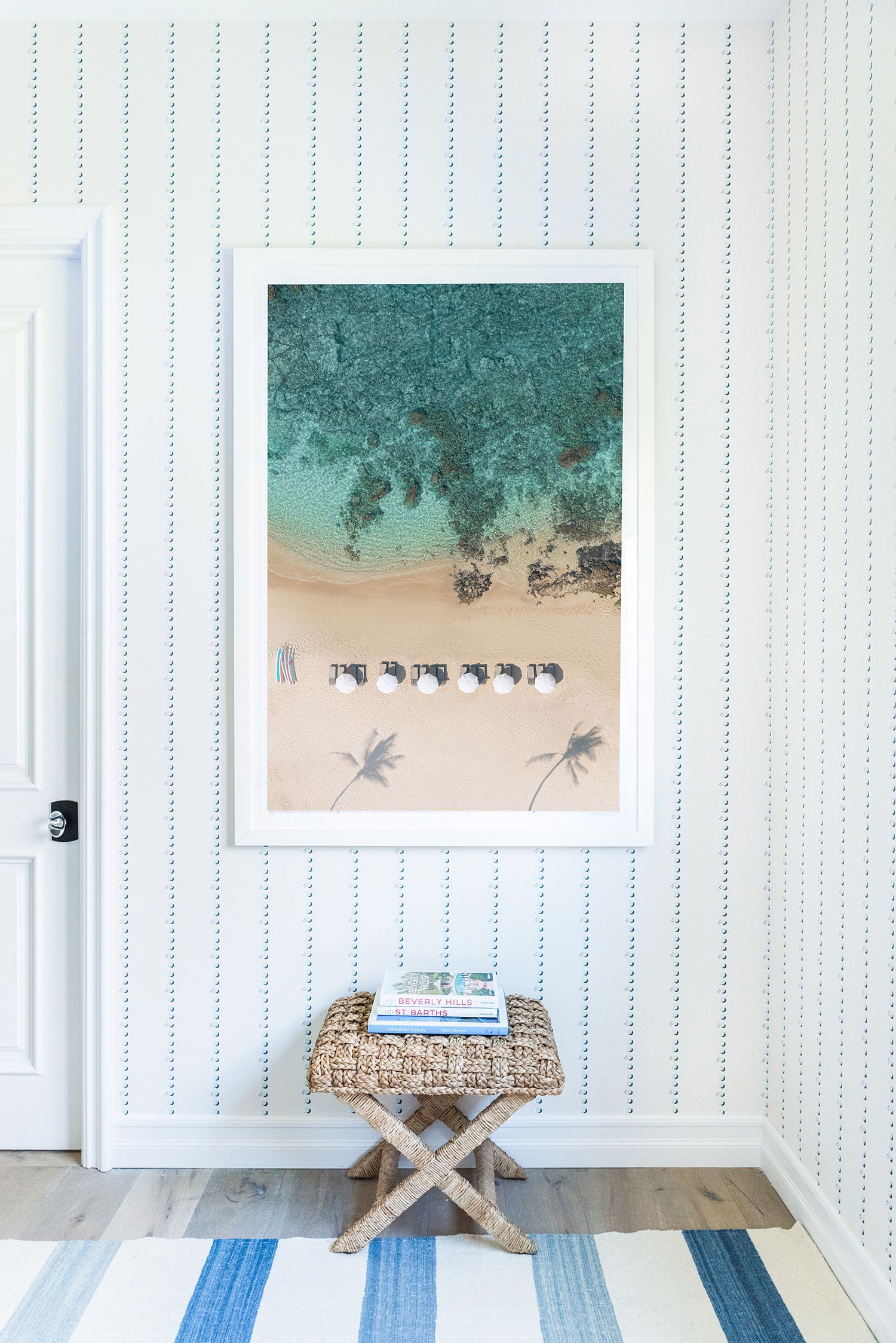
When I redecorate a client’s room, I find adding a little color can be so transformative that it is the difference between going from a film noir to a technicolor spectacular. The shift from true neutrals like grays and beiges of the past decade to color has become customary in design today and I couldn’t be happier. Color sprinkled around a room has the power to uplift a person’s mood as they enter. Close your eyes and think of the affect it has—it practically aerates a room! The addition of color feels welcoming, fresh and livable. Its effect is invigorating, and it can even soothe the soul and add a smile to one’s face.
## Why Blue?
Blue is a cool color that exudes calmness and serenity and has the power to pair with all colors since it is a true cool tone: blue is often added to other colors to change its tone from warm to cool, or vice versa. Perhaps that’s why blue seems to be popping up more often than not in today’s hectic pace. Blues have the ability to create a near neutral palette while still infusing color and life into a space. Just look outside to nature’s most captivating displays: flowers, trees, and animals flourish with the backdrop of a vibrant blue sky. Ever notice how the colors on boats pop and seem more beautiful against the blue water, or how the white homes of Santorini look even whiter and more beautiful against the blues of the ocean and sky surrounding them?
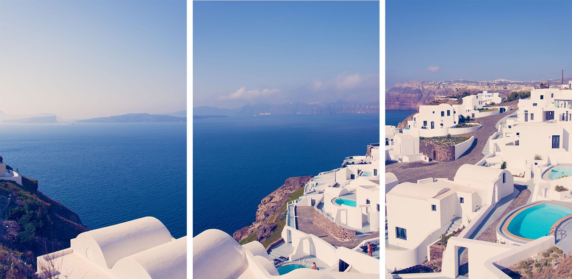
The color blue is so native to us: we are surrounded by it every day, yet we don’t really notice it as we do other colors. What we do notice is how beautiful other colors or things look with blue, just like in nature. Nature has always provided the basis of inspiration in art and design—for instance, before the color spectrum wheel, many artists looked to nature to determine how colors relate to one another—and home décor is no exception.
I’ve had clients show a little hesitancy to introduce color, in the same way there is reluctance in changing their hairstyle, even though results astound. Once you step into a house that has touches of color, it becomes more engaging and personalized. It often dazzles the eye and transforms a house into a welcoming and approachable home.
## How to Use Blue
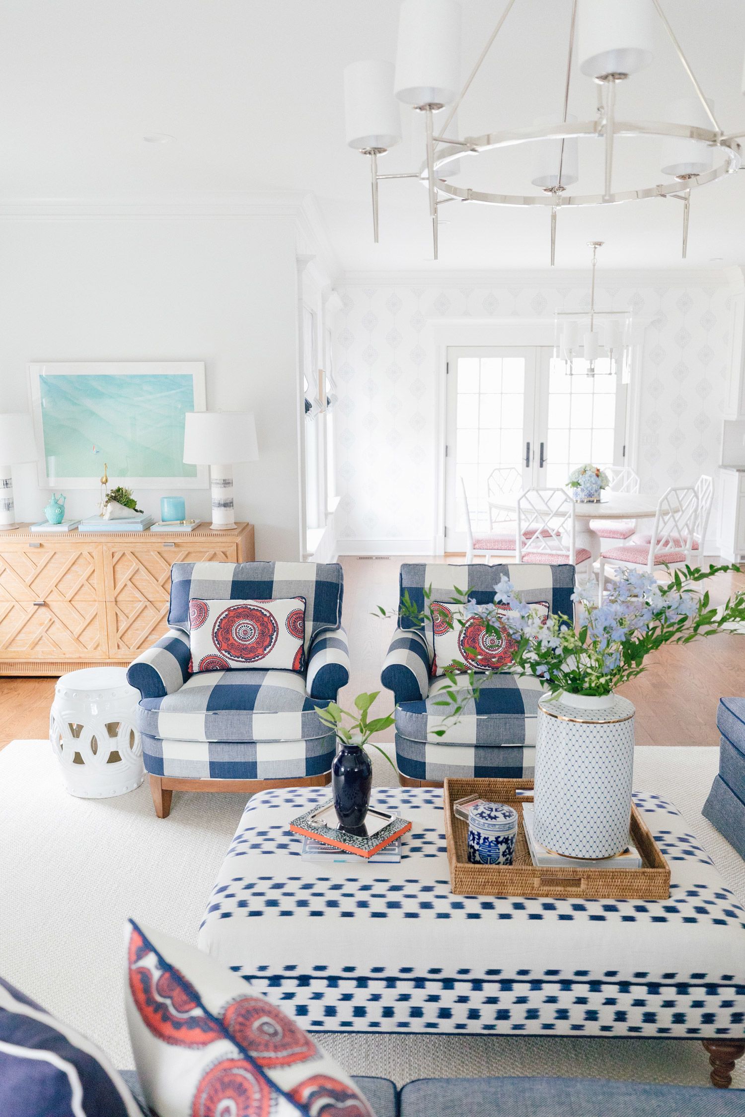
Whether color is utilized through fabrics, accessories, wallpaper, art or paint, it is back and hopefully here to stay. There are many ways to use blues just as you would other neutrals, due to its versatility as an accent color, a background color or the primary color in a rooms story. Instead of going for that gray rug or sofa, use blue as your main neutral color and watch how you notice the colors around it more than the tones of blue. It’s the same concept as your favorite pair of jeans. I can’t think of anything that doesn’t look great with jeans.
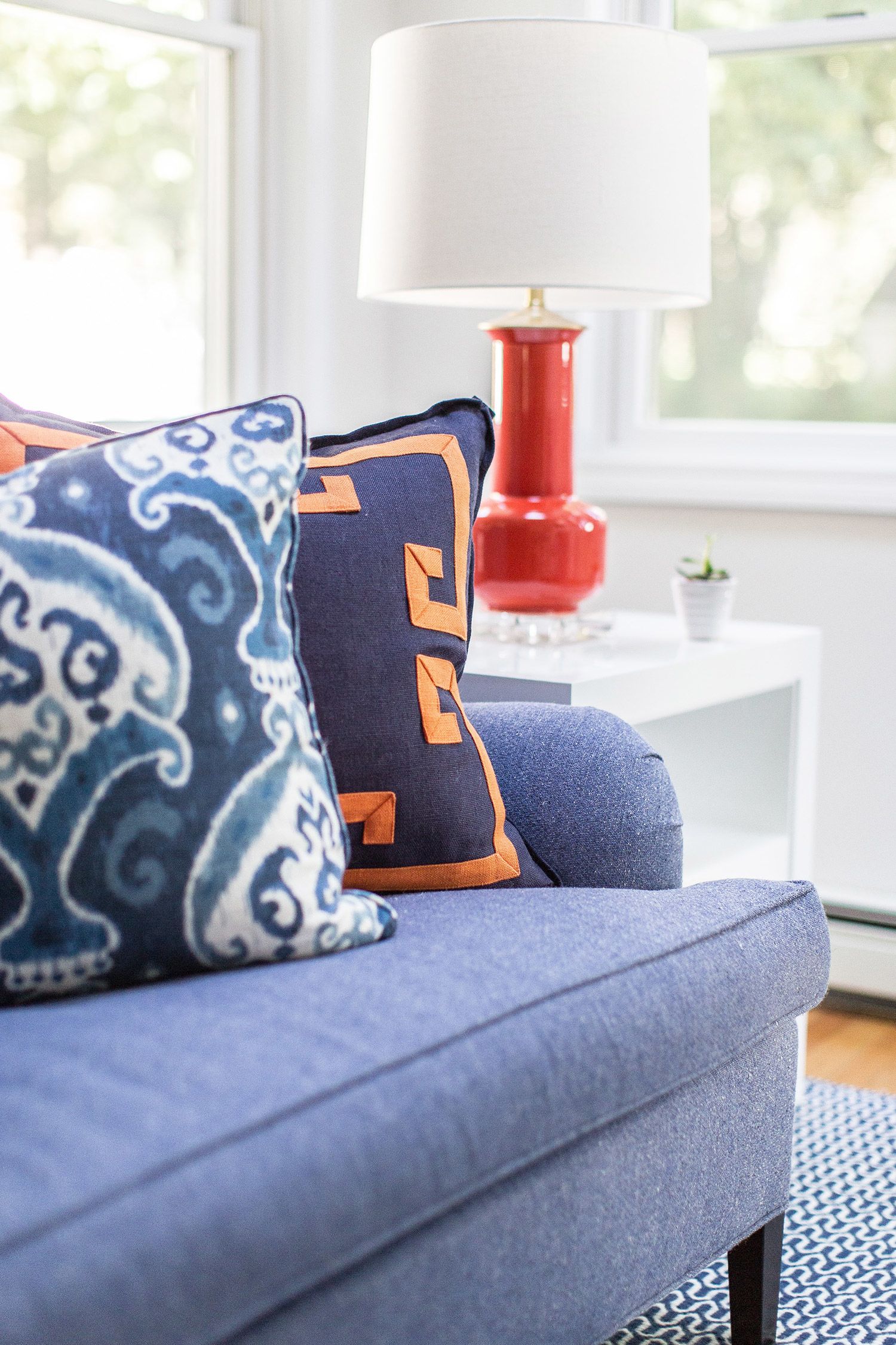
Resurrect an old piece of furniture by painting it a glossy cobalt blue and watch how it works with everything else in the room. Paint your ceiling a pale blue like Benjamin Moore Lily White and it’s like bringing the sky right into your home. (In fact, Gray’s very own living room ceiling is painted a subtle blue!) Everyone loves a crisp white kitchen, however, adding a pale blue or navy blue island will add a burst of subtle energy to the room that a gray island could never achieve. Try it, you just may like it!
## What Shades of Blue Do I Use?
Not all blues are the same, so play with different shades and levels of saturation to achieve the look that you want for your space. Some of my favorites are chambrays and other pale blues because they pair so well with true neutrals like gray, beige and metallics, and allow other colors like mint, lavender and green to shine beautifully. For instance, this master bedroom captures the soothing and calm space to relax and refresh that my clients wanted without sacrificing color. Notice how the pale blue acts as a neutral color and lets the greens in the fabric and art to stand out but not dominate. Yet, it also adds a touch of vitality to the room that another neutral could not achieve.
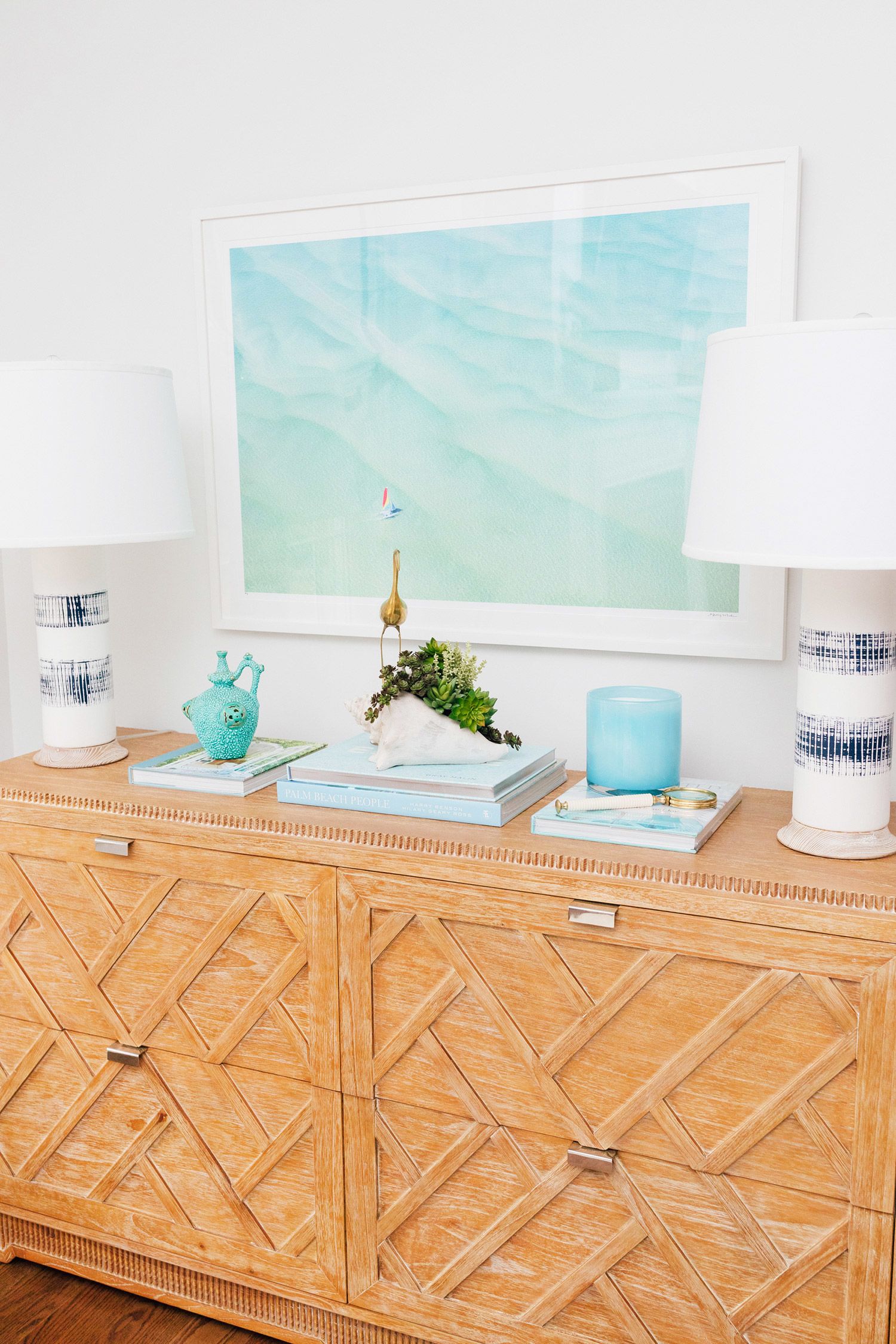
Using various tones of blue as the main color story in a room has the same neutral effect as using true neutrals. You could change the pillows in this room and they would still work beautifully. In the design for this family room below, my clients wanted the ability to change out some accessories in 5-10 years to freshen the room so the palette had to be neutral to allow for that day. Adding other colors to this space can change the overall feeling without having to spend a lot of money investing in reupholstering or buying new furniture. More often than not, people opt for gray, white or cream for key furniture pieces for that very reason—the ability to change it up in a few years just by using different accent accessories. So, opt for blue and see how versatile your room will be.
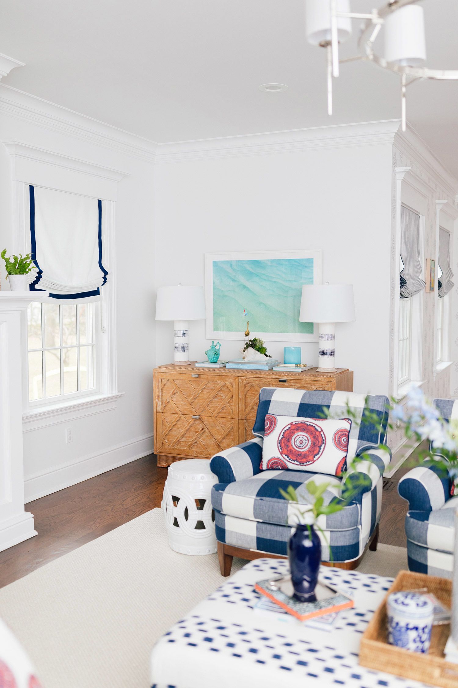
In essence, blue has the ability to carry and enhance colors while having the power to set the energy in the room—whether that energy is vibrance or calmness—just by being... blue! So go for it. Add blue to your home palette and watch how it can change your space and your mood.
Would you use blue as a neutral in your space?
We’re convinced that blue is here to stay… To follow more of Prudence’s work, visit her website and take a peek at her Instagram. (And of course, shop allll the blue prints you can handle right here.)
Xx Team GM
Photos: Katie Tenboer


