


Hi Everyone!
Each December, one of my favorite creative rituals is putting together a holiday color palette — a way of exploring which tones, moods, and seasonal moments feel especially inspiring as the year comes to a close. And this year’s palette might be one of my favorites yet.
For 2025, I’m leaning into foggy blues, champagne tones, warm whites, and the softest hint of blush — a combination that feels wintery without being overtly “holiday,” and cozy without feeling heavy. Think: the glow of dusk in the mountains, the shimmer of early morning waves, the warmth of lantern light, or that barely-pink sky just before sunset.
The best part? Every print featured here is 25% off this December. If you’re refreshing your home for winter — or gifting art to someone special — these pieces embody the subtle magic of the season.
Let’s dive into the palette…
Holiday on the Ranch, Aspen
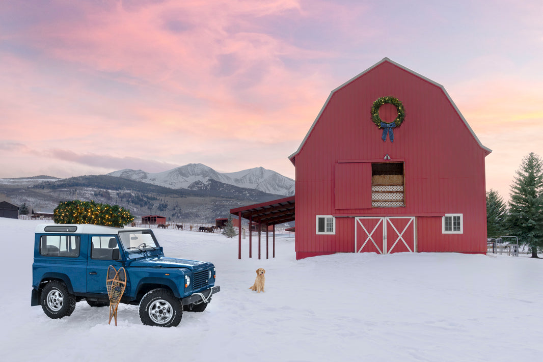
Soft blush skies • Warm whites • Evergreen accents
There’s something so nostalgic about winter in Aspen, and this scene captures that feeling perfectly — a rosy twilight sky, crisp snow, and a bright red barn ready for the season.
The Cabana
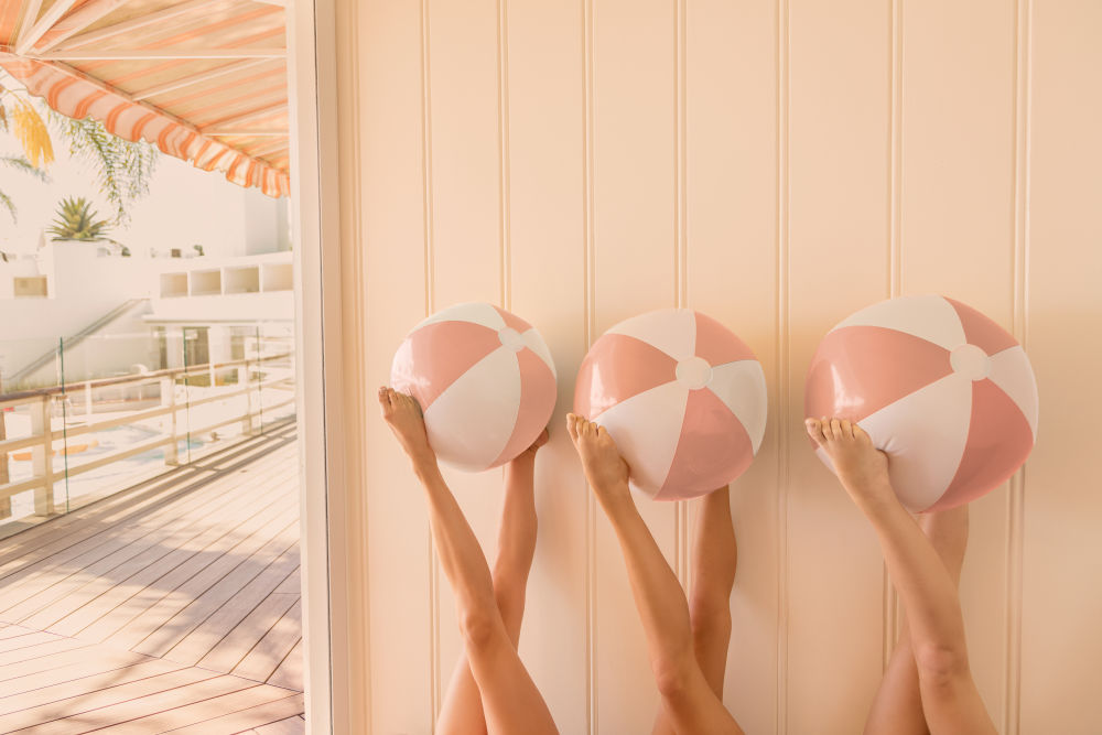
Soft blush • Warm neutrals • Sun-washed glow
Few prints embody the warm-blush tones of this year’s palette quite like The Cabana. With its peachy pastels, playful beach balls, and sun-drenched cabana stripes, this image brings an instant sense of joy and nostalgia.
Spotted at Palais-Royal, Paris
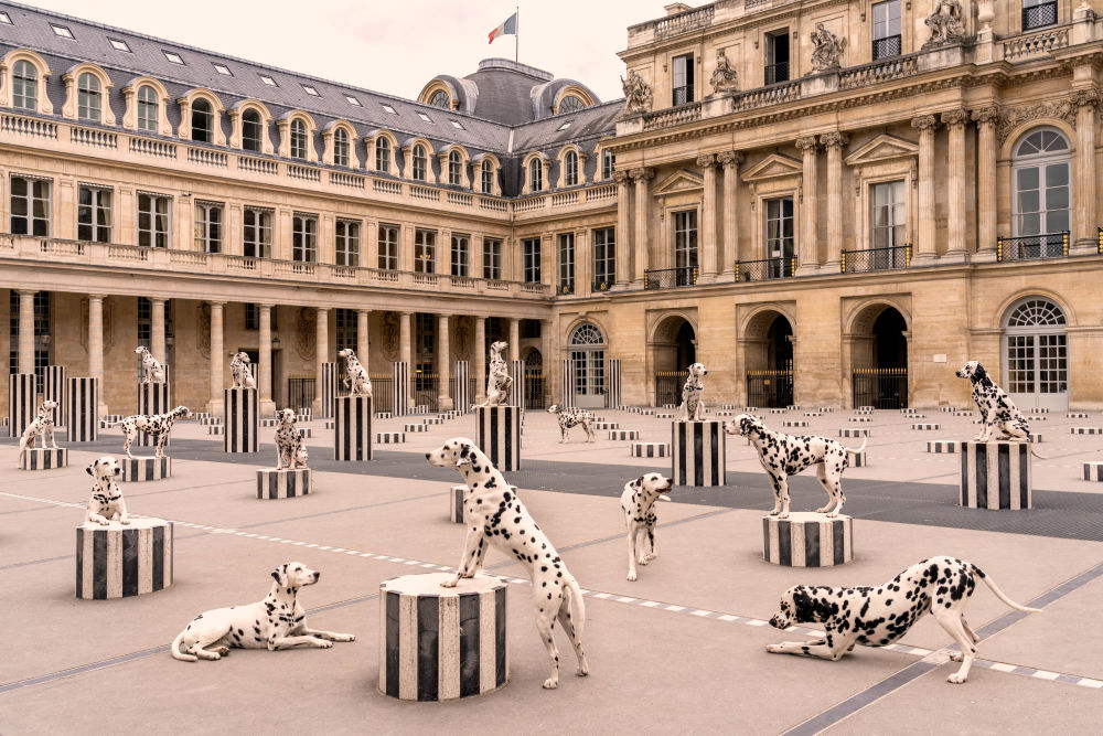
Champagne tones • Warm stone neutrals • Parisian charm
I love how this print brings subtle elegance into a room. The palette is timeless: warm tans, soft shadows, and that perfect champagne hue the Palais-Royal seems to glow with year-round. It’s a beautiful choice for anyone craving a refined, European touch during the holidays.
Zermatt Express
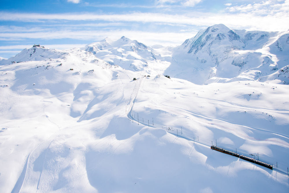
Foggy blues • Crisp whites • Alpine serenity
Few places do winter light quite like Switzerland. “Zermatt Express” delivers icy blue shadows, bright snow, and a sense of stillness that feels almost meditative. This is winter minimalism at its best — clean, cool, and endlessly calming.
Golden Hour, Four Seasons Hualālai
Soft blush • Golden warmth • Reflective water
Holiday palette… in Hawai‘i? Absolutely. Golden Hour brings in that stunning peach-blush light that feels unexpectedly festive — like a tropical take on champagne glow. It's warm, inviting, and a lovely counterbalance to colder tones elsewhere in your home.
Ocean Beach Waves, San Francisco

Fog-washed blue • Pale neutrals • Airy texture
This print is practically made for the foggy-blue mood of this year’s palette. With its painterly whites and weathered blues, it brings an airy softness to any space.
The Elevators, Neiman Marcus, Downtown Dallas
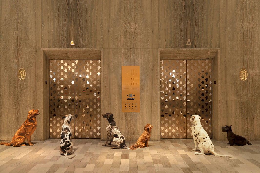
Champagne gold • Warm neutrals • Holiday sparkle
If you want glamour — this is it. This print brings warmth and a bit of festive shine without crossing into literal holiday decor. It’s subtle, stylish, and undeniably chic.
Chairlift Pups

Bright whites • Cozy winter color pops
There’s no holiday color palette without at least one joyful moment — and this one might be my favorite. The snowy backdrop keeps things neutral while the pups’ winter accessories add just the right amount of seasonal cheer. A mood-booster all winter long.
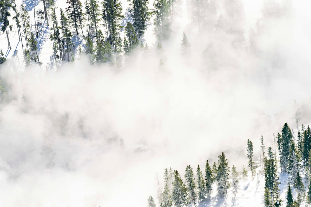
Midway Geyser Basin Fog and Trees, Yellowstone
Misty whites • Soft greens • Dreamy atmosphere
This piece captures that ethereal winter feeling — the kind that’s quiet, dramatic, and incredibly soothing. The mist adds movement, the evergreens ground the scene, and the palette blends beautifully with natural wood interiors.
Bring the 2025 Palette Home
Whether you’re drawn to cool alpine blues or soft champagne warmth, this year’s palette is all about blending winter atmosphere with timeless style. These prints transition seamlessly from holiday decor into year-round living — which is always my favorite kind of design.
And for the month of December, you can bring any of these pieces home for 25% off.
Cheers!
Gray