If you are following along on my Instagram, then you have seen some preview shots of a fab house in Hancock Park that I am helping to update! It is one of those great old L.A. homes, with amazing bones and architecture... but over the years it has had some stylistic additions that might be considered questionable (or at least dated). I was brought in to help the current owners modernize some of the details like lighting, window treatments, rugs, wallpaper, new fireplace tile, etc. The owners (lucky for me), already have AMAZING taste (their furniture selection is ON POINT)... so this job is pure fun! Let's start with the powder room!
## Before:

Here is the before shot.
There is nothing necessarily "wrong" here (except for maybe that window shade, for a few reasons), but I really wanted to take it up a notch. Go big. Go wild. Allow the space to make a statement. I also wanted to reflect the colors that are in the living room, which you will have to wait to see on my blog until we finish up!
## After:

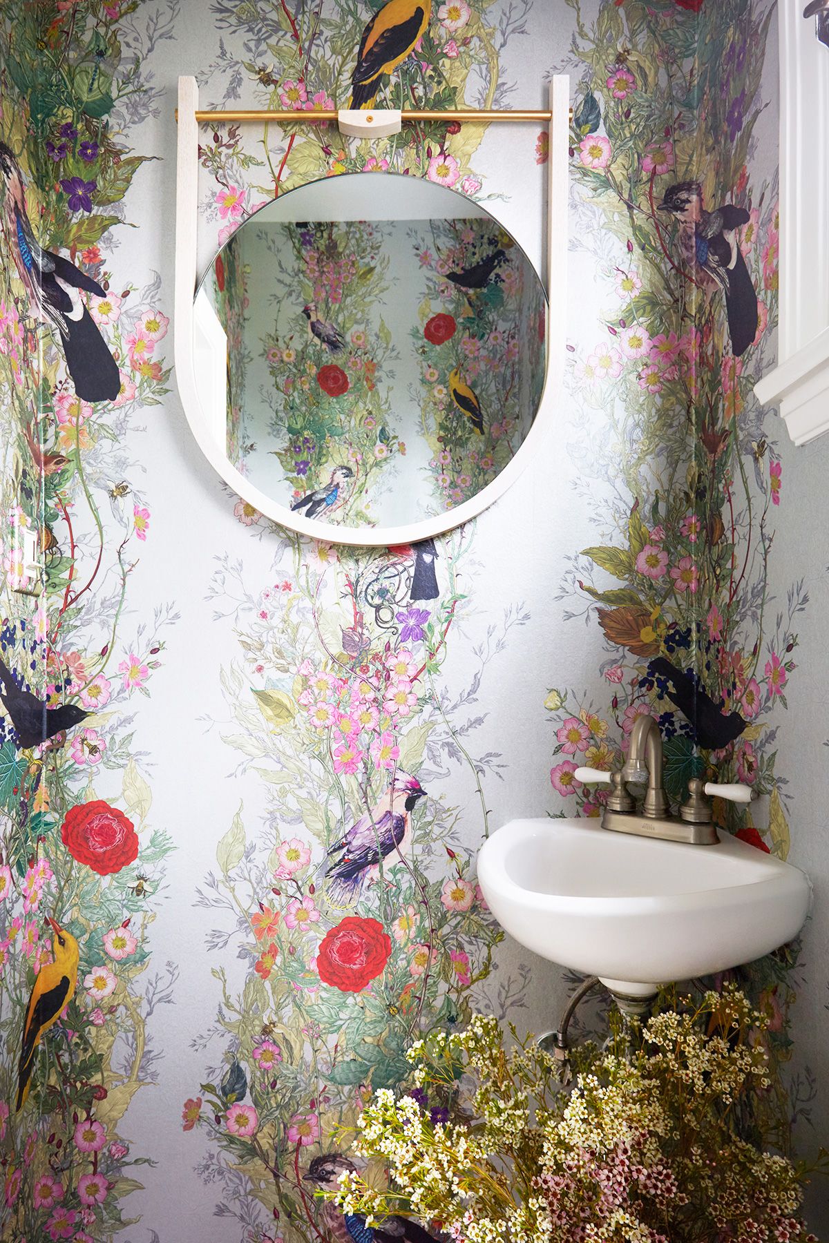
Here is the after!
This is a young, fun, stylish family... and I really wanted to showcase that. The house also has an English country vibe that I wanted to honor... but in a contemporary way. I ripped out that moulding, and went floor to ceiling with this AMAZING Timorous Beasties wallpaper. I replaced a funky, gold mirror with a piece fromLawson-Fenningthat has a more mid-century vibe
...and the window shade will be swapped out with a more simple white version once it is ready (although I love those vines peeking through!). The stool is one of my favorites fromSerena & Lily, and because there is no cabinet or shelving (and I didn't want to add any), I used it to hold asoap dispenser andhand towel from CB2.

Here is the side by side... and let's get into some pattern-on-pattern talk!
I did anentire blog post on this subject, because people consistently ask me about it. “Dee... How do you mix patterns in a cohesive way?” In the new version of the powder room above... I added apatterned rug, to a space with a VERY dramatic wallpaper.
The reason I can do this, is because: 1) the rug is “traditional” in nature—a pattern that has been mixed with others for centuries. 2) It is borrowing from one of the colors of the wallpaper (pink). 3) Although it varies in the shades of pink... there are no other colors involved.

I did something similar in this space, although the “traditional” rug does not borrow any color from the wallpaper. It is neutral enough, though, as to not compete with the rest of the aesthetic

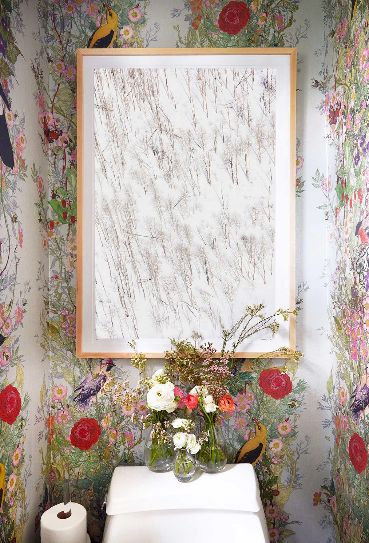
This is perhaps my favorite shot of the bunch, because it also demonstrates how to get “in-the-mix.” Do not be afraid to throw a graphic photograph onto some patterned wallpaper people!
The reason this print of Gray’s works, is because the wallpaper is a large-scale pattern, while the focus of the subject in the photograph is on a smaller scale (and the snow adds negative space and moments for the eye to rest). There is also a common theme that threads the two together—the theme of nature, or branches, to be more exact. The fact that I have layered “winter” on top of “spring” is also pretty playful... and awfully pretty, don’t cha think?
Throw in some fresh flowers and your styling duties are DONE. I am SO digging the branches, on branches, on branches vibe... how about you?

And there you have it! We maximized the HELL out of this mini little space (which is something fun to do if the rest of your house tends to veer towards minimalism).
Is anyone else ready for the comeback of color? It's happening... and I am (obviously) ALL for it.
I want to thankZeke Ruelas for capturing these images. And I also want to thankGray Malin for working with us... and for finding the perfect piece for this project! I can't wait to show you the rest!
And we can’t thank Dee enough for sharing this garden dream with us! To see more of her work and follow along with the rest of this project, make sure to visit her website and follow her on Instagram.
Xx Team GM
Photos: Zeke Ruelas


