
Interiors
Design Direction: Start with Art - Creating a Polished Bathroom with Amber Sokolowski
byTeam GM
4 years ago
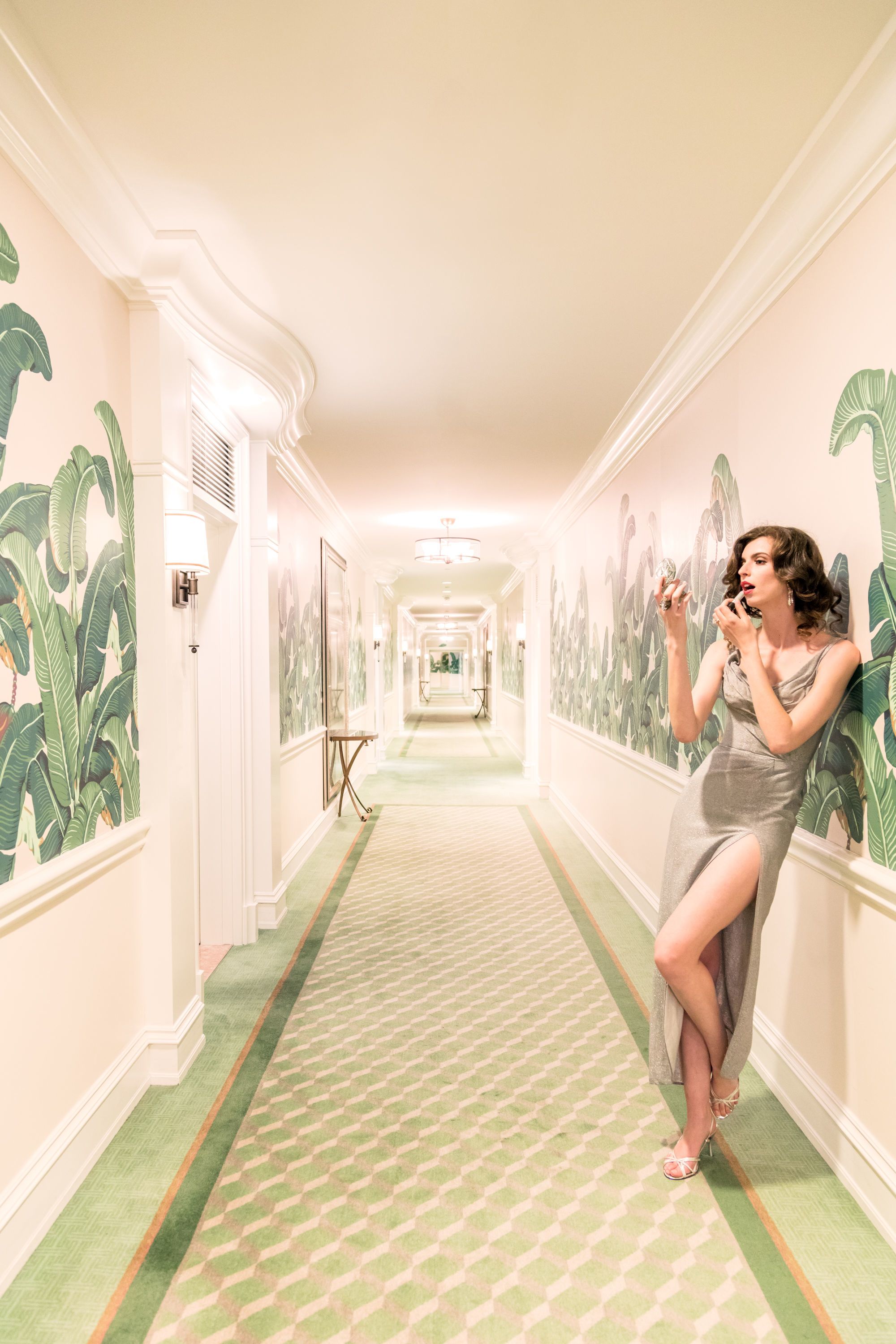
Nothing makes getting ready for the day better than doing so in a beautiful bathroom. In this week’s Start with Art feature, interior designer Amber Sokolowski is give us a look at her updated powder room and sharing how she was inspired by The Touch-Up from Gray Malin at The Beverly Hills Hotel. She’s also sharing some money-saving tips that make a big impact in the space. We’ll let Amber take it from here…
Hi, I’m Amber! After a career in Marketing working for large corporations, I decided to pursue my lifelong passion of Interior Design. My husband and I sold our house and completely restructured our lives to focus on what was most important to us. I enrolled in UCLA’s Interior Architecture and Design program, founded Soko Interior Design, Inc. and haven’t looked back! I feel so blessed every day that I get to do what I love – create beautiful, livable spaces for my clients.
How would you define your interior design style?
I would say my style is pretty eclectic. I have done a lot of midcentury, modern, and farmhouse style projects, but I love so many different styles. When you respect the era and roots of a space, you get the best result.
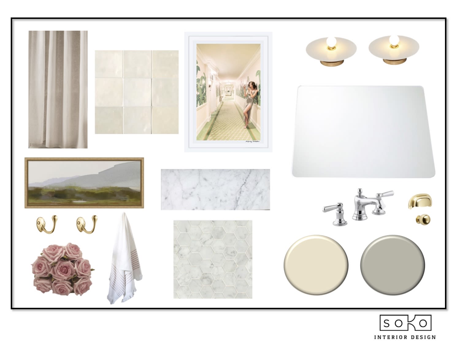
Floor Tile | Shower Tile | Light Fixture | Mirror | Towel Hooks | Towel Ring | Cabinet Pulls | Cabinet Knobs | Shower Rod | Shower Curtain | Towels | Landscape Art | Faucet | Sink
What drew you to The Touch-Up from Gray Malin at The Beverly Hills Hotel?
I love the Beverly Hills Hotel. It’s very elegant and nostalgic at the same time. Also, I liked the idea of the woman looking in the mirror getting ready for something unknown to us. I thought it would be fun and a little cheeky in a bathroom.
What did you pick out as the most important elements of the print to incorporate into the space?
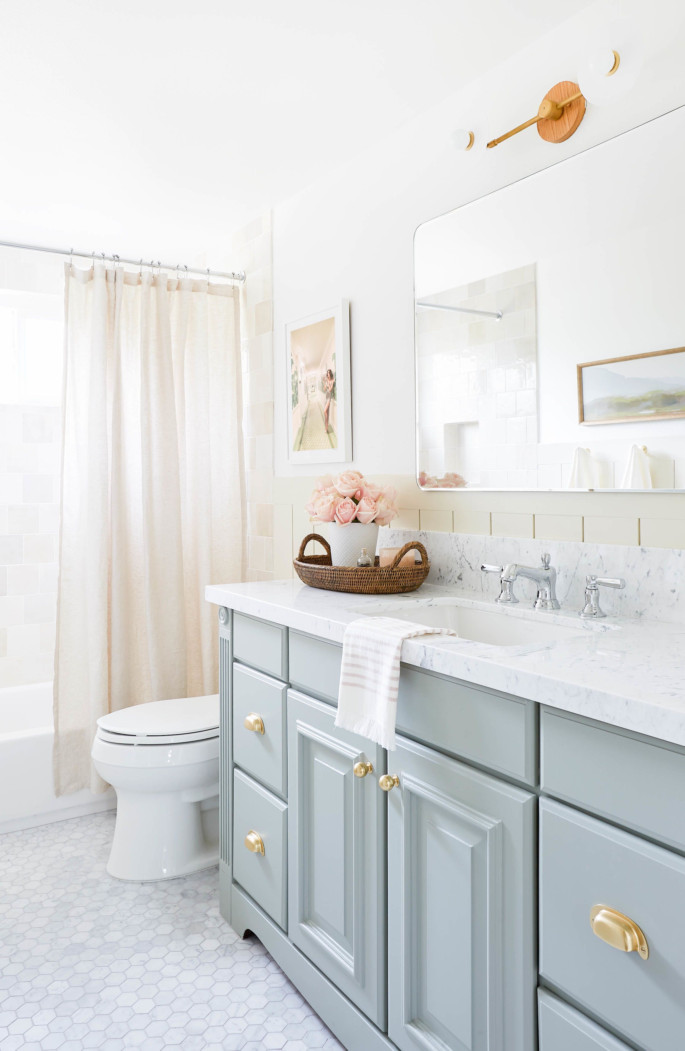
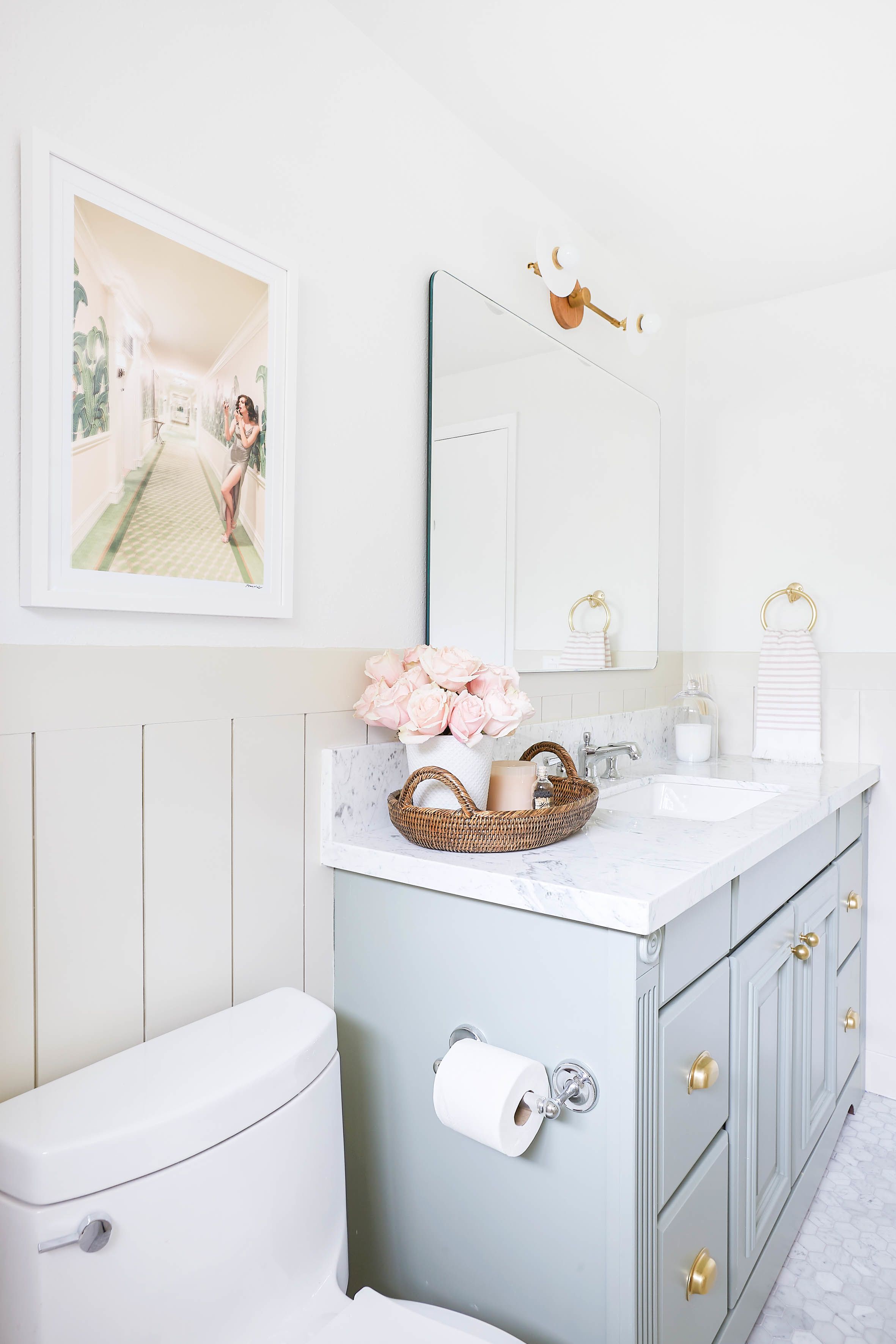
The colors in the photo are soft and neutral and feel a bit spa-like. I went with that as a theme for the space. I used a lot of tans and off whites with a touch of green and pink. Then I used pops of dark brown that draw on the woman’s hair color in the photo. I chose the accessories and accents to make the room feel very luxe and bit retro, which is the vibe I get when I think of the Beverly Hills Hotel and this piece.
What’s one piece of advice you’d give to someone who wants to design a space and start with art?
I like to start with the color palette first. I will pick out the colors I want to draw from in the art and go from there. It’s also important that if you use wallpaper or any other strong pattern in the room, it complements the art and doesn’t compete with it. If you want the art to be the star of the show, the other patterns in the room should be somewhat simple and repeating so the eye doesn’t get too distracted. Also, you can select an element from the artwork to use a theme or feeling you want to evoke, and design around that. For example, with this piece I wanted to draw on the luxurious feeling of the Beverly Hills Hotel, so I used Carrara marble, mixed metals, and pink roses in the décor.
Any other tips for creating a beautiful bathroom space?
I saved a lot of money by repainting my vanity instead of replacing it. I chose the color Pigeon by Farrow and Ball. It’s amazing how the perfect paint color can change the vibe completely. I was also able to score a beautiful marble countertop at savings by calling around to my local slab yards and asking if they had remnants. I was able to purchase this stunning piece at fraction of the cost of a full slab. Finally, we have small children so changing out the glass shower sliding door for a curtain was a no brainer. It’s so much easier to give baths and I love the look of the soft linen curtain.
Thank you for all the tips, Amber! Keep up to date with Amber by following her on Instagram and checking out her website.
Bring home your own work of art on graymalin.com and shop Gray Malin at the Beverly Hills Hotel here.
Cheers!
Team GM
Photography: Jessica Alexander