
Hi Everyone,
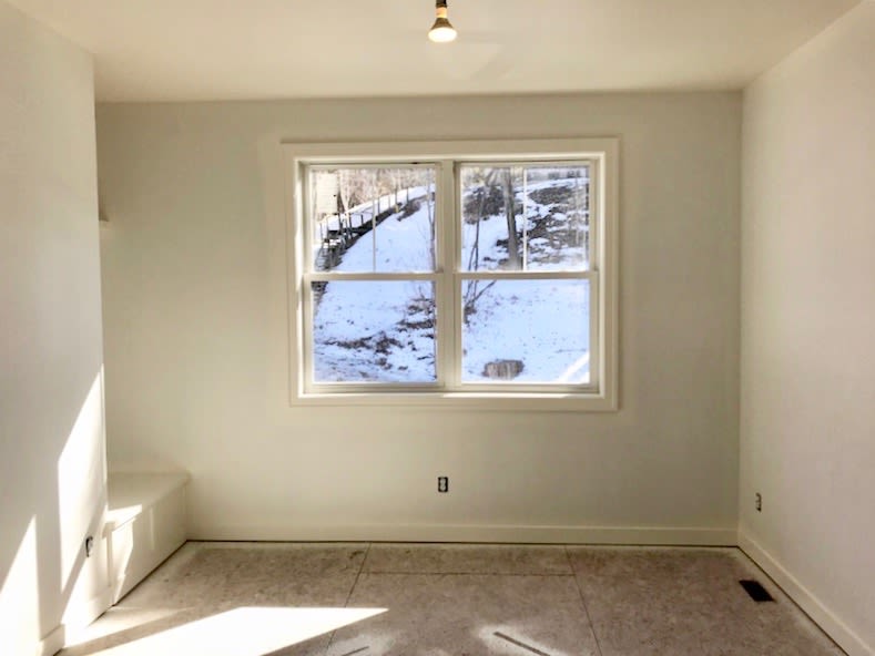
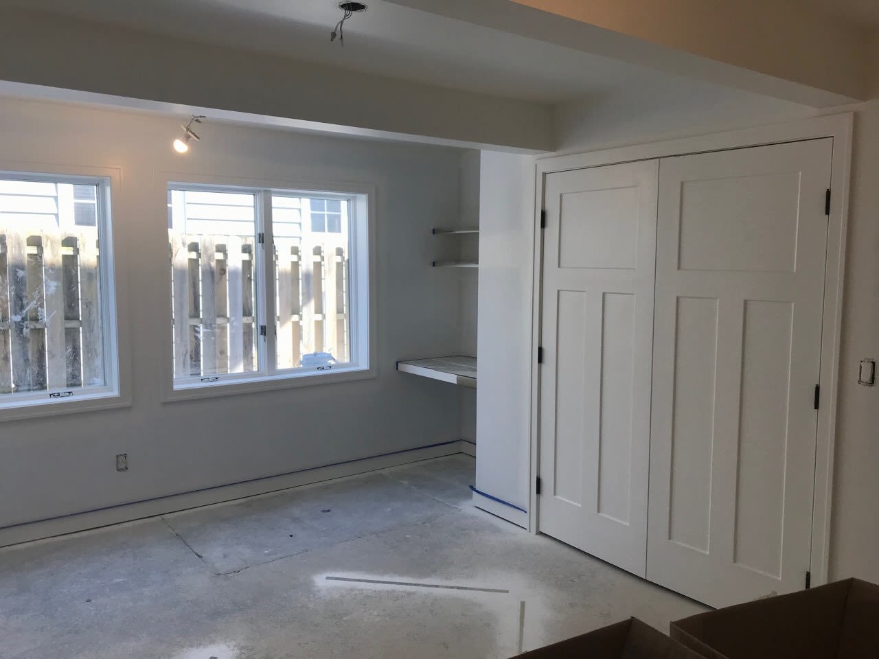
If you’ve been following along, then you already know that I’m knee deep in the renovation process of our new Lake Michigan home which will be ready by Memorial Day Weekend. Though our first post and second post were both great, the part that brings the most joy (aside from completion) is the decorating process!
Well, today’s post is all about that fun part and I’ve got my designer extraordinaire Kate Lester here to elaborate on all of the details. I really hope you enjoy this inside look.
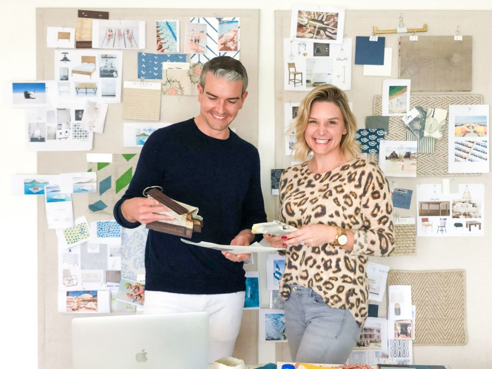
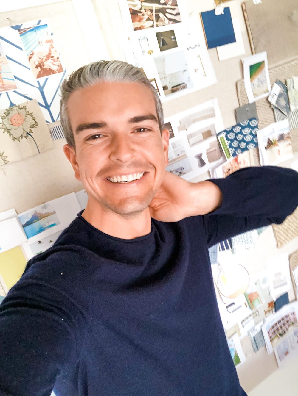
Hey Guys! Kate Lester here. I am Gray and Jeff’s resident interior designer/partner in crime for their Rainbow Ridge Reno adventure. (aka The Lake Michigan Project.) Today, I am here to talk about design. Seriously fabulous interior design to be exact. My team atKate Lester Interiors and I have worked closely with Jeff and Gray to develop all of the gorgeous design concepts for the main living spaces and bedrooms, and we’re going to share some sneak peeks of the concept boards, furniture pieces and art for each space!
THE IMPORTANCE OF CONCEPT BOARDS
Before I delve into the details of our designs for the interior let’s talk concept boards. Rule number one at our studio is that we never design in a vacuum. We spend hours (and hours and hours) tacking everything up on a pinboard to make sure all of the materials, textiles, shapes, colors, and textures jive before the design is presented. Sometimes, in theory, everything “should” look good together but then you tack up the dining table and chairs and realize the legs look “off” next to each other, or that there is too much wood or rattan, or all the textiles give you the same sensory overload as an Indian street market. Doing our concept development this way also allows us to select all elements of space at once. We never pick rugs and furniture and art separately. I think when you do this, you miss a real opportunity to create a flow and continuity. Seeing everything together also enables us to make art & photography selections based on colors that we want to amplify and helps us notate what textures/shapes/tones we want to add in when accessorizing on install day. Since many of you have been following along with the progress of this project so far, I thought I would share a few of our design concepts for the interior with you before the big reveal! Read on to see how we pulled, picked, and pinned our way from concept to completion.
LIVING ROOM
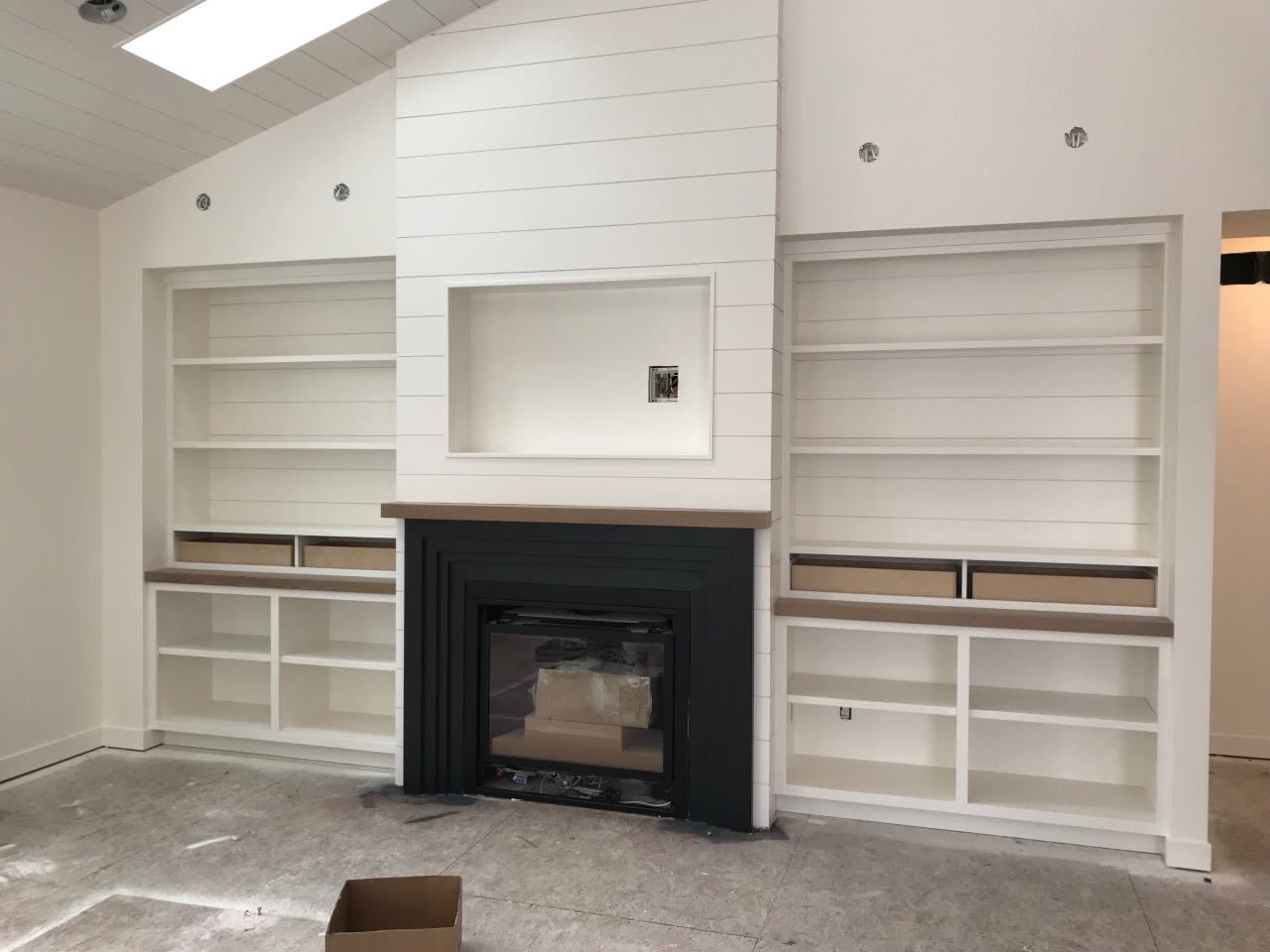
Because the Michigan house has an open floor plan, we began with the living room during conceptual development. To anchor the seating area in front of the fireplace we started with an oversized neutral textured rug fromALL MODERN. Inexpensive textural natural fiber rugs were a staple of pretty much every room in this house. They are not only durable, but they add softness and are easy to replace after of few years of water, sand and sun wear and tear. During our initial meeting with Gray and Jeff, they had requested that this room have enough seating for entertaining guests, but also feel comfortable and intimate enough to snuggle up and watch a movie with the kids after a long day at the lake. The sectional and chairs fromLEE Industries Upholstery offer clean lines and wood elements and create a conversation area. The upholstery is all stain protected and family friendly, plus we stayed with darker washed hues to give it longevity. Furniture these days should really play double duty (like everything else in our lives) so we included our custom waterfall ottoman/coffee table hybrid fromKate Lester Home. It’s the perfect solution for a family room because you can put your feet up and have a place to set down a cocktail. (And it’s completely customizable!) We kept it from feeling too serious by covering it in a patterned fabric fromPeter Dunham Textiles. Accent pillows bring in the movement to the solid sofa and tie in the neutral tones and greens found in Gray’s photography that is the main focal point over the fireplace, in the entry, and dining area. When selecting these pieces, we decided to create a really curated look, so we mixed Gray’s collections, genres and color palettes. It was important to me that this home showcase the breadth and depth of Gray’s catalog and include some of his and Jeff’s most personal favorites. Gray’s new collection fromBermuda really represents the casual, coastal aesthetic we were going for throughout the home, so it makes sense that the “Bathing Beauty” would be a focal point in the living space.

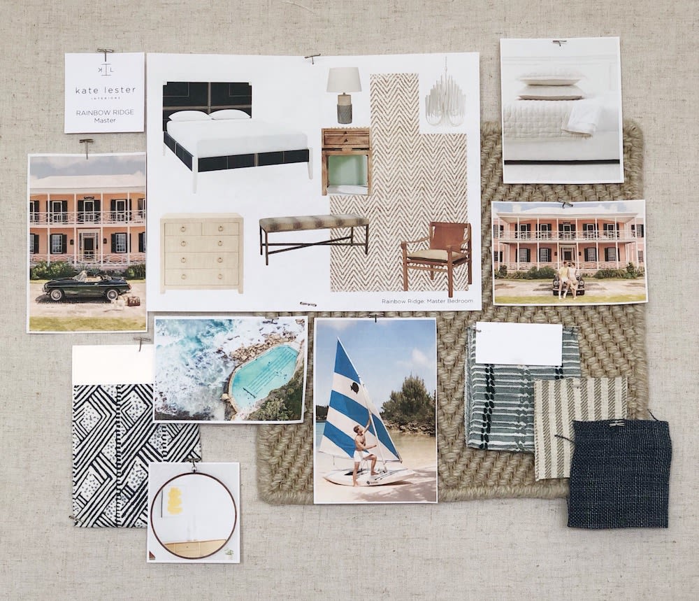
MASTER BEDROOM
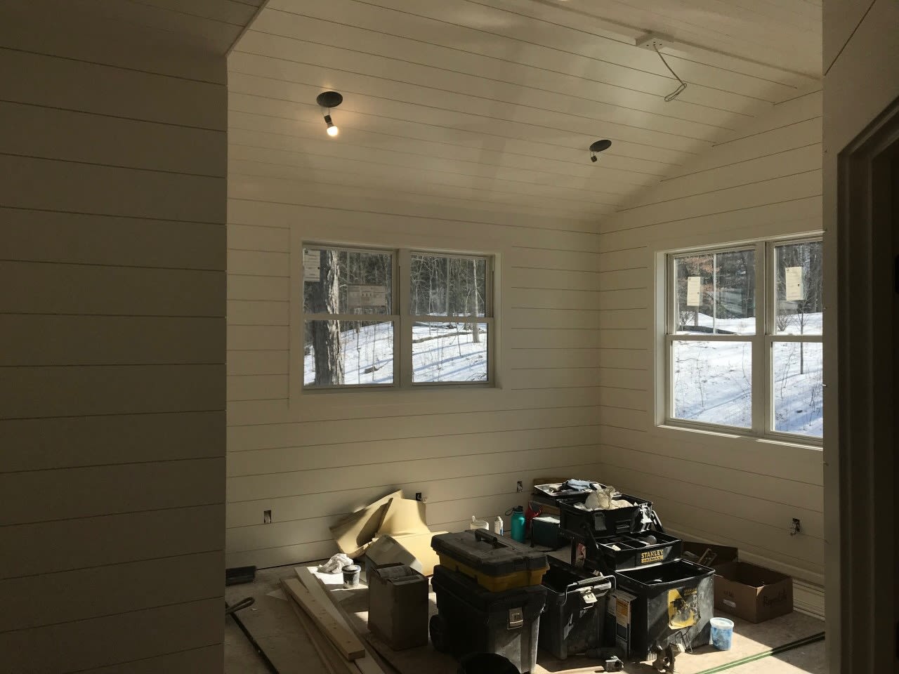
The master bedroom is completely covered in horizontal shiplap paneling painted Wimborne White byFarrow & Ball, so the vibe here was always going to be “preppy lake house chic”, and lots of it. Classic, coastal, and crisp were the words of the day when we designed this space, and we ran with it. Gray has a deep and unwavering love for navy blue (which is why we’re friends) so we anchored the room with a fantastic woven bed in that hue. We sprinkled in more classic features like pinstripe fabrics to ramp up the prep factor, and a gorgeous handmade distressed leather chair fromLEE Industries to warm things up and add a little funk- which makes me a very happy designer. When it came to the art, we created wow factor with scale and color. An oversized print of “The Sailor” will greet everyone who enters and one of his favorite aerial beach shots makes the space feel serene and bright.
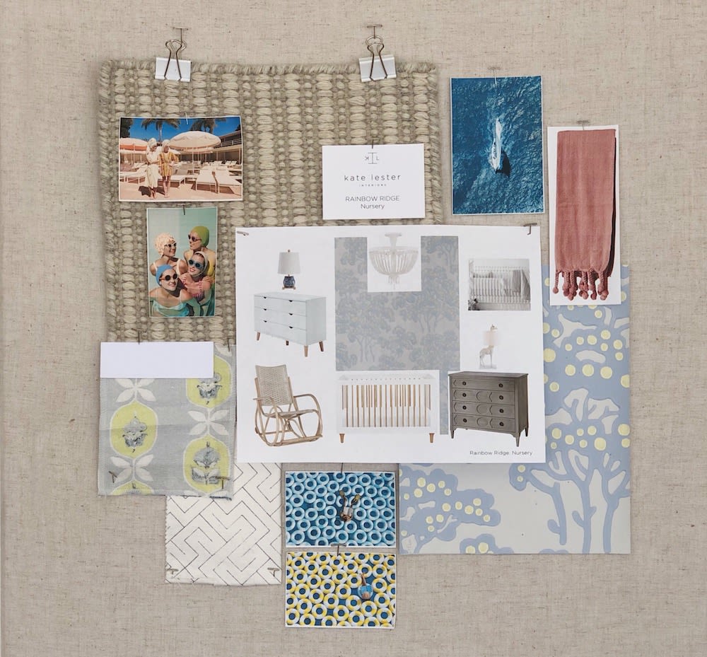
NURSERY
I absolutely love designing nurseries because babies are adorable, and they are the best clients because they don’t talk. They always just smile at our designs, so it’s a win-win. (Or maybe it’s just gas.) This nursery was super-special though because Gray and Jeff’s babies are literally the cutest ever. They are twins, and a boy and a girl, so the nursery had to feel sweet and serene, but gender-neutral. The entire palette started with a gorgeous wallpaper fromFarrow & Ball and evolved from there. We kept the space pretty tonal with shades of greys, dusty blues, and hints of a citron-inspired yellow. Contemporary cribs and a changing table/ dresser are juxtaposed with a fantastic vintage inspired rattan rocking chair and grey washed chest. (All found atALL MODERN) We added a little whimsy with the drapery fabric and lamps to keep things fresh and the nursery from feeling too formal. Gray has so many fabulous pieces we could have used for the nursery but for some reason we all kept coming back to the two color variations of “The Diver.” Nothing says “I’m living my best lake-life” like an inner tube, and these prints really exude the whimsy we were looking for in this space.
GUEST ROOM
When Gray explained his request for this bedroom, I literally laughed out loud! “Who puts three twin beds in a bedroom?” I asked. Then I came to visit the community where the home is located with Gray and his family and I realized it was not only totally common, but it was really practical for guests and families, and I was sold on the idea. Since we were planning to do something unorthodox with the layout, I also wanted to go big with the design. The entire room is wallpapered in a white and navy herringbone wallpaper from Serena & Lily. (Yes. ALL of the walls!) Three rush twin beds and benches bring in texture and warmth and a really dynamic lake house vibe. Unique nautical inspired ceiling mount fixtures add dimension and hand-block printed textiles keep it feeling collected. This room also really pays homage to the whimsy ofthe Coral Casino series, so be sure to look for another dynamic oversized piece here, as well as a chic print of those fabulous Aqualilies above each bed.

In closing, this whole experience has been so fun because Gray and Jeff have a real innate sense of color, scale, and pattern, so it was easy for them to understand our selections, and when something wasn’t working, it was fairly easy for us all to agree why and come up with a new and improved selection. What I learned during this process with Gray, is that even though he is a little more preppy and I am a little more rock and roll, this makes for a really fantastic collaboration. He was there to stop me when my selections got a little too “funky or vintage-y” and I was there to push him to embrace some of the other colors and textures he would not normally have gravitated to. (Hello tan and brown!!)
As of today, products are shipping, fabrics are cut, wallpaper is being installed, and our flights are booked for the big week-long install/ photo shoot in April! Stay tuned for our next post about the second phase of the construction process from both Gray’s and my perspective!
Thanks, Kate! Here’s me SUPER excited about it all! Stay tuned for more, the renovation continues, and we will definitely be documenting it all.
Cheers
xx
GM